
Colour schemes to chase away the January Blues
As the festive season fades away and the winter chill sets in, January can often bring a sense of gloominess.

But if your New Year’s resolution is to attract a buyer, one of the best ways to inject some brightness into your living space is with a punchy, cohesive colour scheme. Ready your home for the market this year with one of these refreshing colour palettes.
Soothing greens
Due to its natural connotations, green creates soothing spaces that make us feel better connected to the outside world. As it sits at the centre of the colour wheel, green is a beautiful transition colour which can be paired with both warm and cool tones. If you’re looking for warmth, use touches of yellow, as two colours from the same family can work harmoniously together. For something more modern, try soft tonal shifts in green shades to create a restful yet invigorating space.
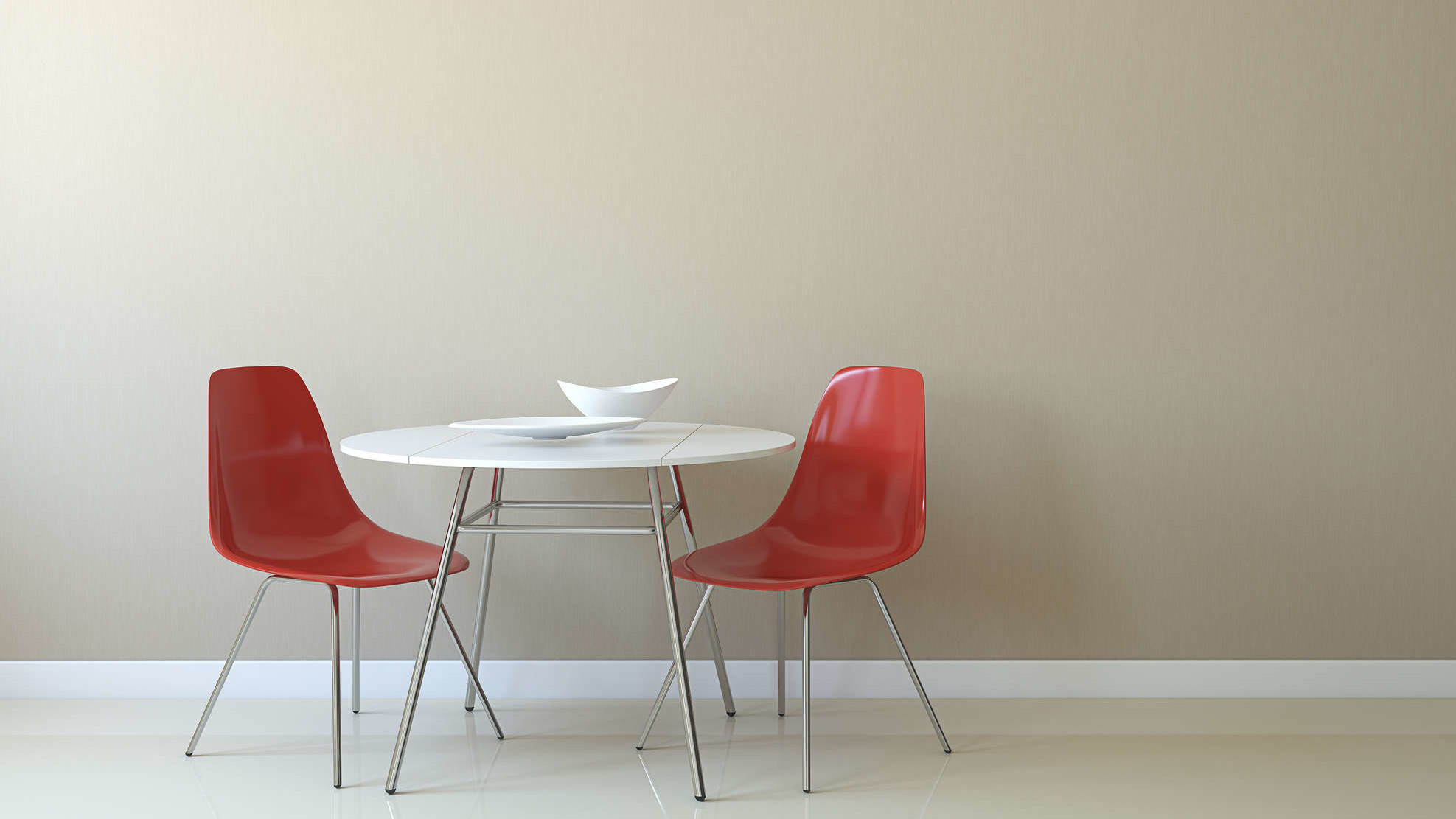
Daring reds
Red brings a sense of energy into a living space, making it the perfect shade for dreary January. Make a statement with a bold accent wall of maroon or carmine, or bring a muted palette to life with some intense pops of crimson using throw pillows, vases, and canvases.
Dreamy sunset hues
Bring some warmth back into the home by incorporating a timeless sunset colour scheme. Offset the drama of the burnt oranges, reds, and golds with a cooling touch of blue or purple. This will have your home looking bright and sunny year-round.
Earthy neutrals
Embrace the natural beauty of earthy neutrals like warm taupe, soft beige and creamy white. These compatible shades create a sophisticated and calming environment, perfect for a minimalist aesthetic. To keep things dynamic, mix and match neutral tones for a classic yet versatile look.
Elegant jewel tones
Amp up the elegance in your home with luxurious jewel tones such as sapphire blue, deep burgundy or emerald green. These colours are rich and full of depth, so make sure to use them sparingly against neutral backgrounds to add a touch of opulence, without overwhelming the space.
Coastal blues
If you’re yearning for summer, bring it back into your home with tones taken straight from a sea view. Create a cool, coastal feel with refreshing shades of ocean blue, then work in a few eye-catching accents of red, yellow or purple for an element of contrast and warmth.
Soft pastels
Pastels are bright colours that have been diluted, making them ideal for the home. Chalky and pale colours give rise to delicate, minimal rooms. Create a relaxing and elegant space with sugary shades of rose, mint, and taupe.
If you’re considering a change of scenery, our team is here to assist you in finding the perfect property.
Contact us today to explore the possibilities
This article was originally published by BriefYourMarket and is reproduced here with their permission.
For more company news and insights from Pygott & Crone, click here


Latest news

Shared ownership: Is it a stepping stone or a trap?
Shared ownership is one of the most widely discussed routes onto the property ladder for first-time buyers who cannot afford to purchase outright.

Conveyancing Explained: What Happens Between Offer and Completion
The moment a seller accepts an offer feels like the conclusion of a long process.

Why Families Are House Hunting Right Now Instead of August
The family buyer is the most time-constrained purchaser in the property market.

The Green Upgrades Tenants Actually Care About vs The Ones They Don't
The language around energy efficiency in rental properties has become increasingly technical.